This Student Performance dataset includes scores from three exams and a variety of personal, social, and economic factors that have interaction effects upon them.
Data source: http://roycekimmons.com/tools/generated_data/exams
Data samples: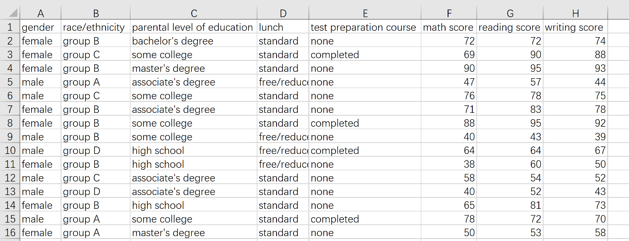
1 | import pandas as pd |
Purpose of visualization:
How effective is the test preparation course?
(x, y) represents the proportion(y) of the number of people with this score(x) to the total number of people with/without test preparation.1
2
3
4
5
6
7
8
9prep_none = SP.loc[SP['test preparation course'] == 'none']
prep = SP.loc[SP['test preparation course'] == 'completed']
bar0 = Bar("Test Preparation Efficiency", "Math")
bar0.add("none", prep_none['math score'].value_counts().sort_index().index,
prep_none['math score'].value_counts().sort_index().values / len(prep_none['math score']))
bar0.add("completed", prep['math score'].value_counts().sort_index().index,
prep['math score'].value_counts().sort_index().values / len(prep['math score']))
bar0.render("1-prep2math.html")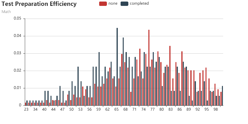
1
2
3
4
5
6bar1 = Bar("Test Preparation Efficiency", "Reading")
bar1.add("none", prep_none['reading score'].value_counts().sort_index().index,
prep_none['reading score'].value_counts().sort_index().values / len(prep_none['reading score']))
bar1.add("completed", prep['reading score'].value_counts().sort_index().index,
prep['reading score'].value_counts().sort_index().values / len(prep['reading score']))
bar1.render("1-prep2reading.html")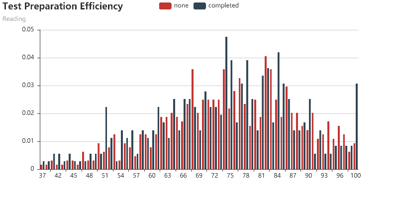
1
2
3
4
5
6bar2 = Bar("Test Preparation Efficiency", "Writing")
bar2.add("none", prep_none['writing score'].value_counts().sort_index().index,
prep_none['writing score'].value_counts().sort_index().values / len(prep_none['writing score']))
bar2.add("completed", prep['writing score'].value_counts().sort_index().index,
prep['writing score'].value_counts().sort_index().values / len(prep['writing score']))
bar2.render("1-prep2writing.html")
These histograms show that test preparation courses do not play a big role in overall scores, but they do help people to get high scores(100) in reading and writing.
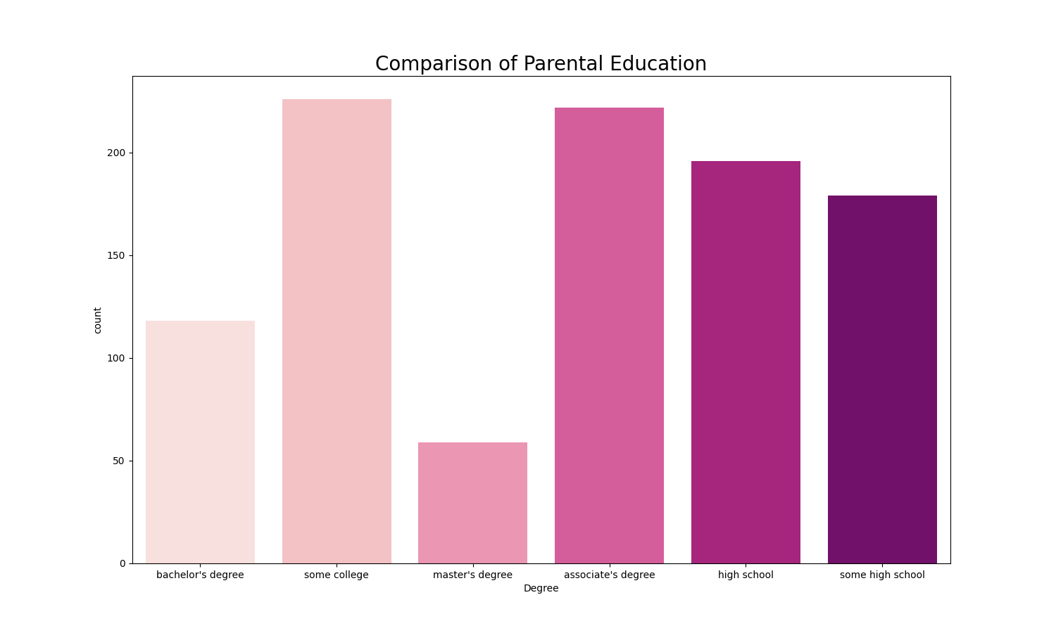
What is the distribution of parent level of education and how they contribute to students’ scores?
1 | plt.rcParams['figure.figsize'] = (15, 9) |
1
2
3
4
5
6
7
8
9
10
11
12
13
14
15
16
17
18
19
20
21
22
23
24
25
26
27
28
29
30
31
32
33def getgrade(score):
if score >= 90:
return '>=90'
if score >= 80:
return '80~90'
if score >= 70:
return '70~80'
if score >= 60:
return '60~70'
else:
return 'Fail'
sns.countplot(x=SP['parental level of education'], data=SP, hue=SP.apply(lambda x: getgrade(x['math score']), axis=1),
palette='Reds')
plt.title('Parent Education vs Math Scores', fontsize=20, fontweight=30)
plt.savefig("2-Education2Math.png")
plt.show()
plt.clf()
sns.countplot(x=SP['parental level of education'], data=SP,
hue=SP.apply(lambda x: getgrade(x['reading score']), axis=1), palette='Blues')
plt.title('Parent Education vs Reading Scores', fontsize=20, fontweight=30)
plt.savefig("2-Education2Reading.png")
plt.show()
plt.clf()
sns.countplot(x=SP['parental level of education'], data=SP,
hue=SP.apply(lambda x: getgrade(x['writing score']), axis=1), palette='Set2')
plt.title('Parent Education vs Writing Scores', fontsize=20, fontweight=30)
plt.savefig("2-Education2Writing.png")
plt.show()
plt.clf()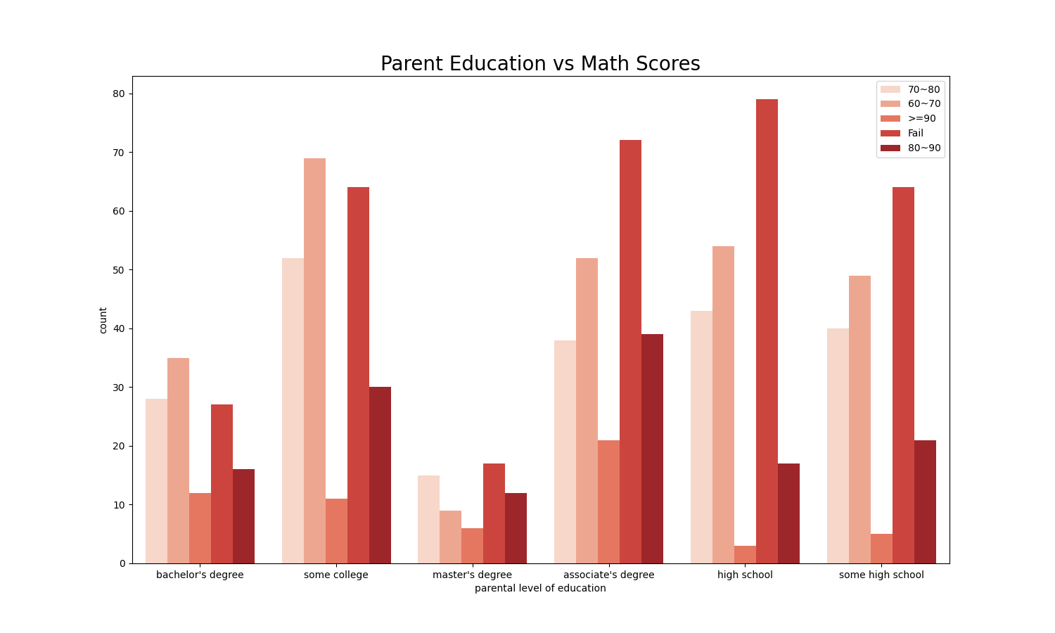
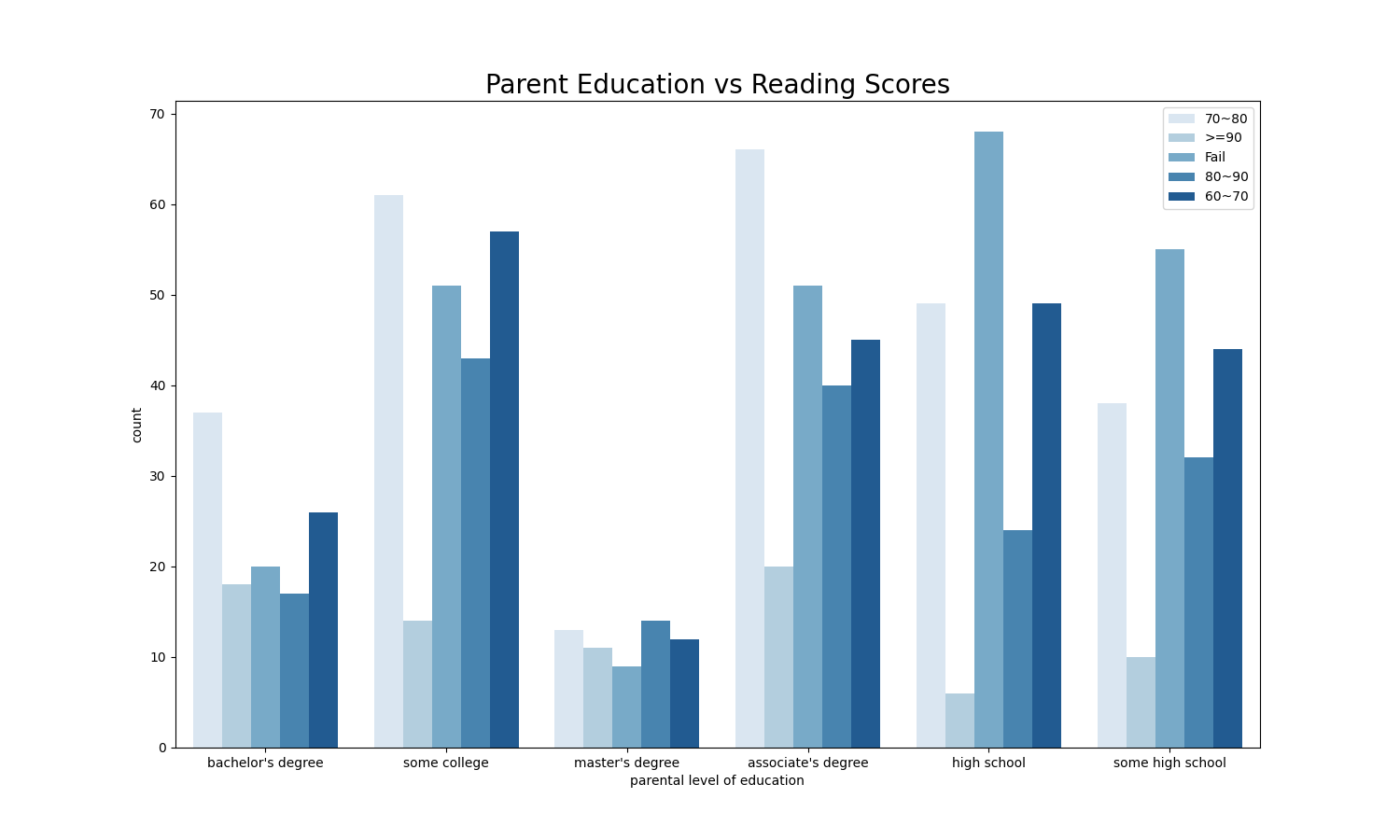
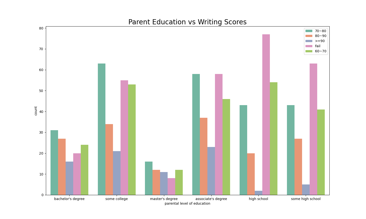
Most of parents have degree from college or high school, only a few parents have bachelor’s or master’s degrees. Students whose parents have bachelor’s or master’s degrees are less likely to fail the class.
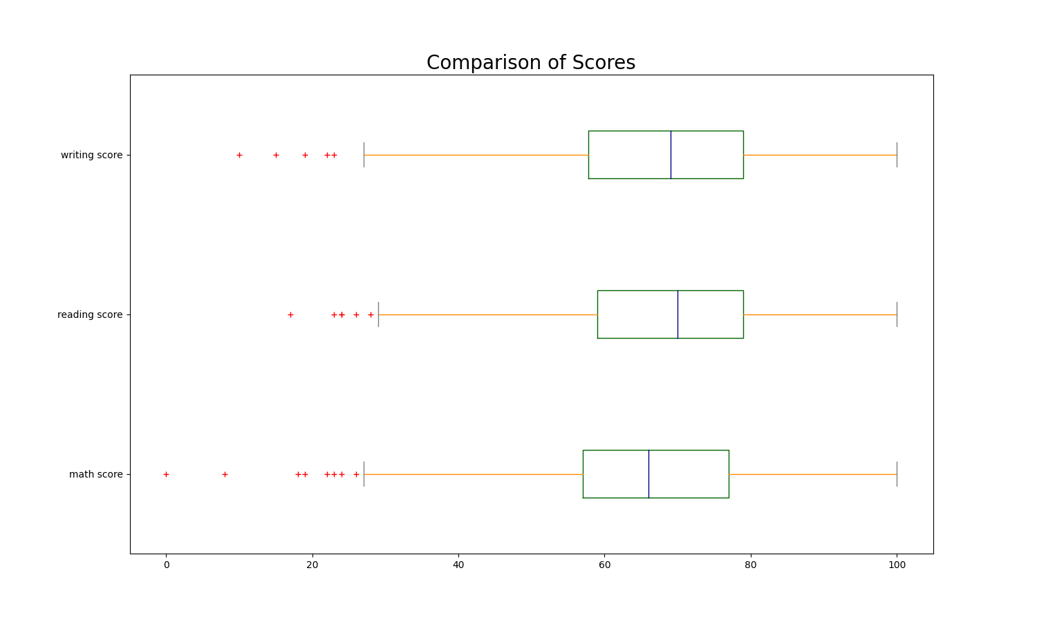
What are the statistical characteristics of each subject’s scores and the distribution of total score?
1 | plt.rcParams['figure.figsize'] = (15, 9) |
1
2
3
4
5plt.rcParams['figure.figsize'] = (15, 9)
SP.hist(['math score', 'reading score', 'writing score'], ec='black', grid=False, color='slategrey')
plt.savefig("3-Scores_hist.png")
plt.show()
plt.clf()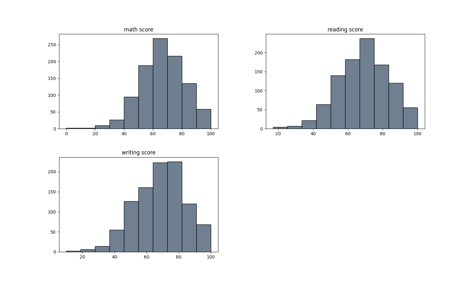
The highest scores in three subjects are 100. Median of writing and reading is around 72 while median of math score is around 66. 25% - 75% scores are in range of 56/58 to 78/80.
The distribution of each subject scores can be approximated to the normal distribution.
What is the hidden relationship among students’ performance in various subjects?
1 | plt.rcParams['figure.figsize'] = (15, 9) |
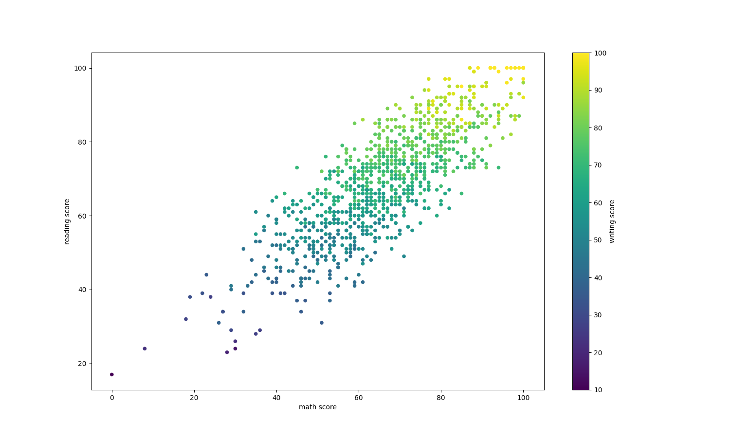
We can see from the scatter plot combined with heat map that the performance of each student in the three courses is very similar, and there is no obvious biased student. Most students pass all three courses. Students with high reading scores also have high writing scores, but their math scores are not necessarily as high. There are more people with a score of 80 or higher in reading and writing than in math.
How does gender and race influence to each subject?
1 | sns.countplot(x=SP['gender'], data=SP, |
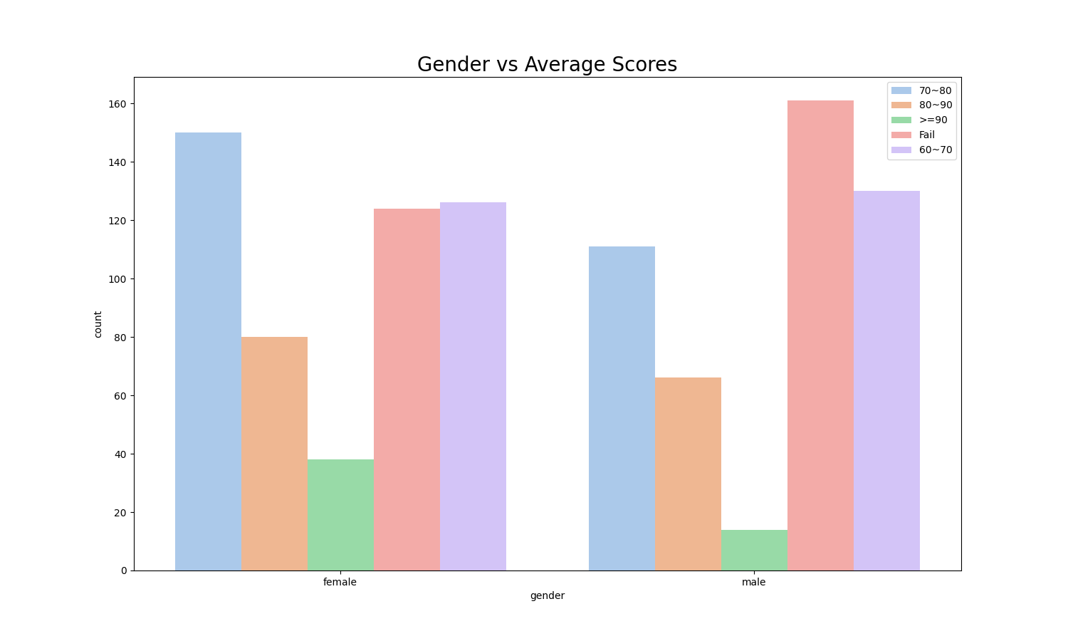
This histogram shows that the average score of female is higher than that of male, and the proportion of male who drop out of courses is greater than female.1
2
3
4
5
6
7sns.countplot(x=SP['race/ethnicity'], data=SP,
hue=SP.apply(lambda x: getgrade((x['math score'] + x['reading score'] + x['writing score']) / 3), axis=1),
palette='husl')
plt.title('Race/Ethnicity vs Average Scores', fontsize=20, fontweight=30)
plt.savefig("5-Race2Ave.png")
plt.show()
plt.clf()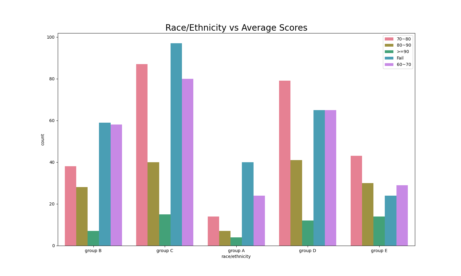
Group C has a higher proportion of failing the sources in average while group E are more likely to get a nice score (>=90).